all_to_uniform#
Import packages#
import matplotlib.pyplot as plt
import numpy as np
import scipy.ndimage as spim

import porespy as ps

ps.visualization.set_mpl_style()
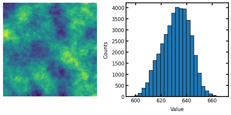
Generate image for testing#
im = np.random.rand(200, 200)
strel = ps.tools.ps_disk(20, smooth=False)
im = spim.convolve(im, weights=strel)
fig, ax = plt.subplots(1, 2, figsize=[8, 4])
ax[0].axis(False)
ax[0].imshow(im)
ax[1].hist(im.flatten(), edgecolor="k", bins=25)
ax[1].set_xlabel("Value")
ax[1].set_ylabel("Counts");
Demonstrate function#
The correlated noise field generated above has approximatetly normally distributed values. It’s not perfectly normal, but it’s pretty close. This can be converted to uniformly distributed values as follows:
im1 = ps.tools.all_to_uniform(im=im)
fig, ax = plt.subplots(1, 2, figsize=[8, 4])
ax[0].axis(False)
ax[0].imshow(im1)
ax[1].hist(im1.flatten(), edgecolor="k", bins=25)
ax[1].set_xlabel("Value")
ax[1].set_ylabel("Counts");

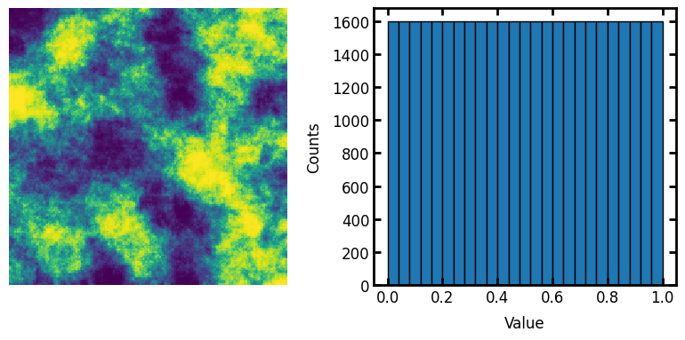
scale#
The output can be scale to a specific range:
im2 = ps.tools.all_to_uniform(im=im, scale=[0, 1])
fig, ax = plt.subplots(1, 2, figsize=[8, 4])
ax[0].axis(False)
ax[0].imshow(im2)
ax[1].hist(im2.flatten(), edgecolor="k", bins=25)
ax[1].set_xlabel("Value")
ax[1].set_ylabel("Counts");